Shooting in colour will always seem a very simple thing, especially so if you only know what digital photography. But colours in photography fulfill much more than the role of bringing things to life.
Colours in a photo, or in video, can help you a lot on telling the story or when to set the mood for the scene. Colours are very useful tools in the life of any artist, be it a photographer, painter, or designer.
And today we’re going to talk a bit about colours in general, but mostly colours in photography.
How to use colours in photography
Understanding how colours communicate and understanding what mood may be the result of a colour are very special things. For some people, this type of synaesthesia is essential to produce certain feelings.
Using my great love of music as an example it is very common for a certain song to sprout in a certain tone, and this usually represents the feeling that music passes me.
And as if listening to a quieter song my mind filled with a bluish purple colour, and this brings me a certain tranquility. Or when I hear a heavier sound, which is usually the preference here in the house, orange and red tones appear, which make me pay more attention to what is happening around me.
Yes, I know this sounds like conversation from someone who just had a certain type of herb or mushrooms, but it’s not like that.
So when I think of colours in photography, I try to put the same feeling I have with music in action.
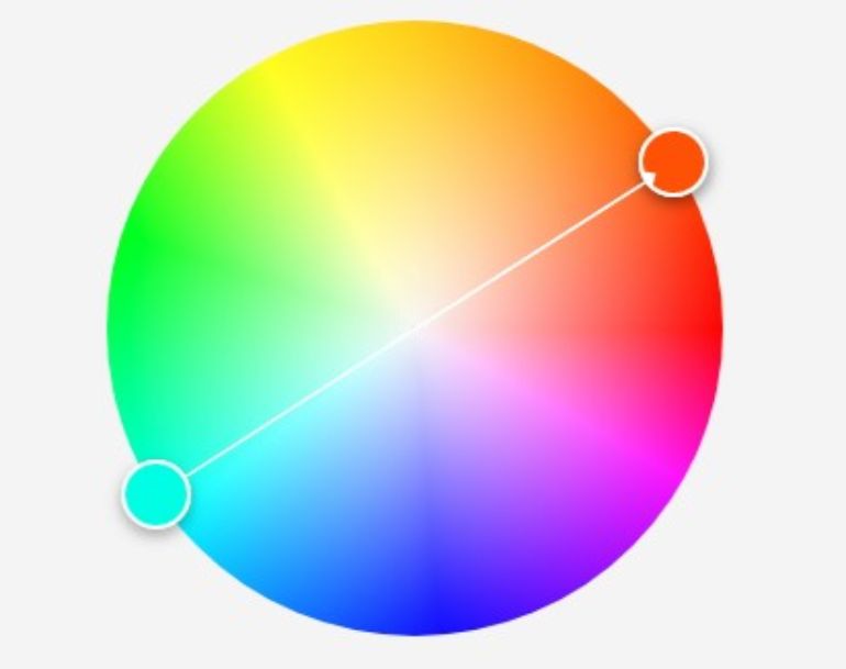
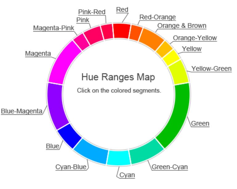
To understand certain things we need the help of a simple colour wheel where we have the primary colours of red, yellow and blue and their complementary colours.
Understanding this colour wheel is key to producing good colour photographs.
For many photographers, this is an intuitive thing, and they are able to feel the compatibility of colours. But it is also a skill that can be learned from practice.
How to make a good colour combination ?
The combination of colours is something essential in a work that will be distributed in a colourful way. Not only photos, but also drawings, movies, paintings and so on.
Concerning how colours communicate the feeling the artist wants to convey and also how colours speak to each other can be a lifelong study. It is the same thing as leaving art itself and going to branches such as psychology, for example.
Complementary colours
The first combination of colours we see are the complementary colours. In the photo below, we see that the teal/green colour is complementary to the colour orange/red. Soon, we can use this relationship between these colours to create special features in our photos.
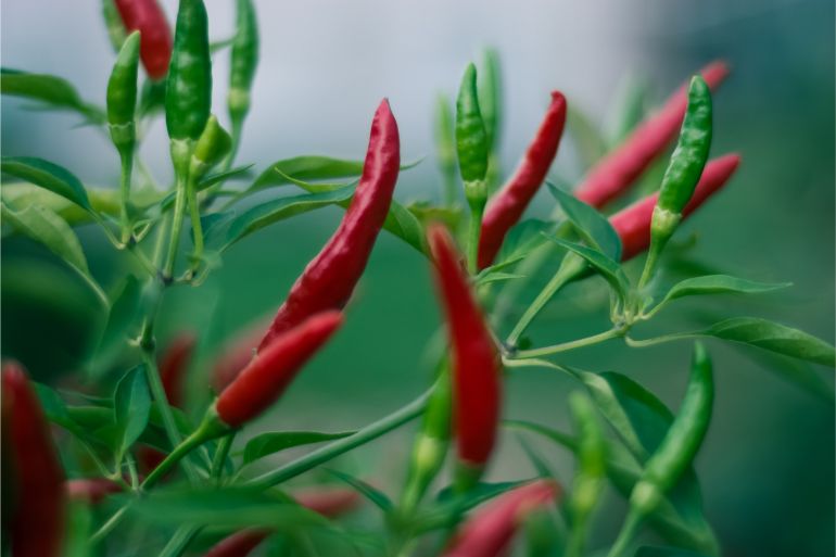
As we can see in the photos above, the peppers stand out much more because of the green background of the photo. And talking about colours in photography, this is a good use of complementary colours.
Of course, we can divide the colour wheel into many more segments, and thus achieve a much wider range of shades.
Using basically the same complementary colour ratio, we managed for example to get to the so famous Teal and Orange colour scheme. Which is nothing more than a shade of green and a shade of orange working together, and most part of the movies after 2000s use.

This type of placement is very famous in the movies and TV series, where the shadow of the scene has this more greenish colouring, while the brighter parts of the photo hang towards something more reddish orange.
You can not only manipulate the colouring of your photos in post-production, but can also do so while preparing the photo. Choose a background colour that is the complementary colour of the dominant colour of your portrait, and see how everything will collaborate to bring attention to the main object. The same goes for clothes that models will wear or for landscape photos, try planning the photo to incorporate complementary colours
Other combinations
In addition to the complementary colours we still have other combinations that also have the same job, use the colours to communicate something. These combinations are:
- Analogous Colors
- Triad
- Monochrome
- Shadows
Once we understand the relationship between colours, it becomes much easier to think about how and why to combine them. The main combinations will basically cover everything you will do when working with colours in your life!
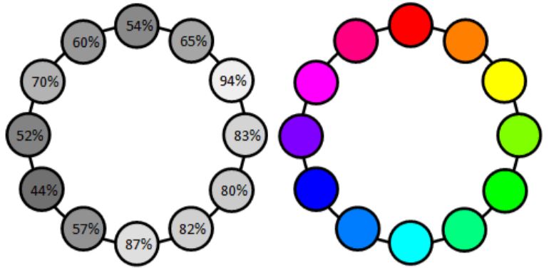
Análogas Monocromáticas Sombras Tríade
Luminance, contrast, saturation, and hue
In addition to the colours relating to each other, they also have a great relationship between it selves and how we perceive them. There are many people who can see differences between two shades of green. For other people these differences may be non-existent.
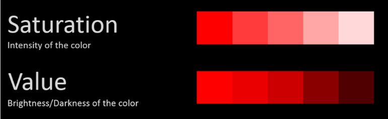
One of the differences that can easily go unnoticed by people is the luminance of colour. The luminance is nothing more than how bright or dark is the colour.
In addition to the luminance in the colours, we also have two other pillars, saturation and hue. Saturation defines the intensity of the colour. We know that the more intense the colour, the more attention it will draw. But very saturated colours can be annoying and quickly tire the viewer’s eyes.
Speaking of hue it is a way to distinguish one colour from another based on the amount of red, green or blue present in the colour.
The hue can join with the luminance property of the colour, so that we can define the transparency of the colour. We can say that the hue is what gives the colours names.
The colour contrast is the difference in luminance of two nearby colours that will at some point be superimposed. A simple example is a portrait of someone with black hair under a black background. The colour contrast in this case will be very minimal, making it difficult to distinguish the background of the photo of the person’s hair. On the other hand, same black hair over a white background will have a higher level of colour contrast.
A very cool site to see what is the level of colour contrast is the Webaim.org where you can set the colour of the background and foreground and get an idea of the amount of contrast. Null colour contrast will have a 1:1 level while full colour contrast will have a 21:1 level.
But what colors work well together?
A simple way to start working with colours is to look for colours that belong to the same family (for example, shades of red and orange). These are known as analog colour schemes. Often, you will find them occurring naturally in nature, and they are harmonious and pleasing to the eye.
If you are shooting with similar colours, you need to make sure that there is enough contrast between the colours to create an interesting photo.
Once you master this, you can go on to work with complementary colours. These are opposite colours on the colour wheel (for example, red and green). This can create a very vibrant scene, but it is inadvisable to use them in large doses.
A good way to use complementary colours would be to photograph a landscape with lots of green grass and trees, with some red details to create a high contrast look.

A more complex way to work with colours is to examine the colour schemes of the triad. Triads colours are those evenly spaced around the colour wheel (for example, purple, orange, and green).
As complementary colours, a triadic colour scheme can be very vibrant, so it is better to work with one dominant colour and the other two used as support. In general, colours work well when you follow these rules because they provide a well-combined and attractive image. Of course, there are exceptions to the rule.
But, like all rules, it’s best to learn how they work them break then
In summary, colour photography can be much more complex than black and white work, as you should feel colour compatibility. But it is a task that can be mastered by practice!
See you guys later and share this f****** post!

